
Kubex turns a wall of numbers into clear next steps with Claude
Use Cases
An autonomous Kubernetes and AI optimization platform is only worth having if people can act on it. Kubex collects cost, utilization, saturation, risk and automation data across clusters, node groups, namespaces and containers (at enterprise scale, that can mean hundreds of thousands of containers across dozens of clusters) and it showed nearly all of it at once. Power users coped. Everyone else opened the dashboard and could not tell where to start.
Challenge
An autonomous Kubernetes and AI optimization platform is only worth having if people can act on it. Kubex collects cost, utilization, saturation, risk and automation data across clusters, node groups, namespaces and containers (at enterprise scale, that can mean hundreds of thousands of containers across dozens of clusters) and it showed nearly all of it at once. Power users coped. Everyone else opened the dashboard and could not tell where to start.
Approach
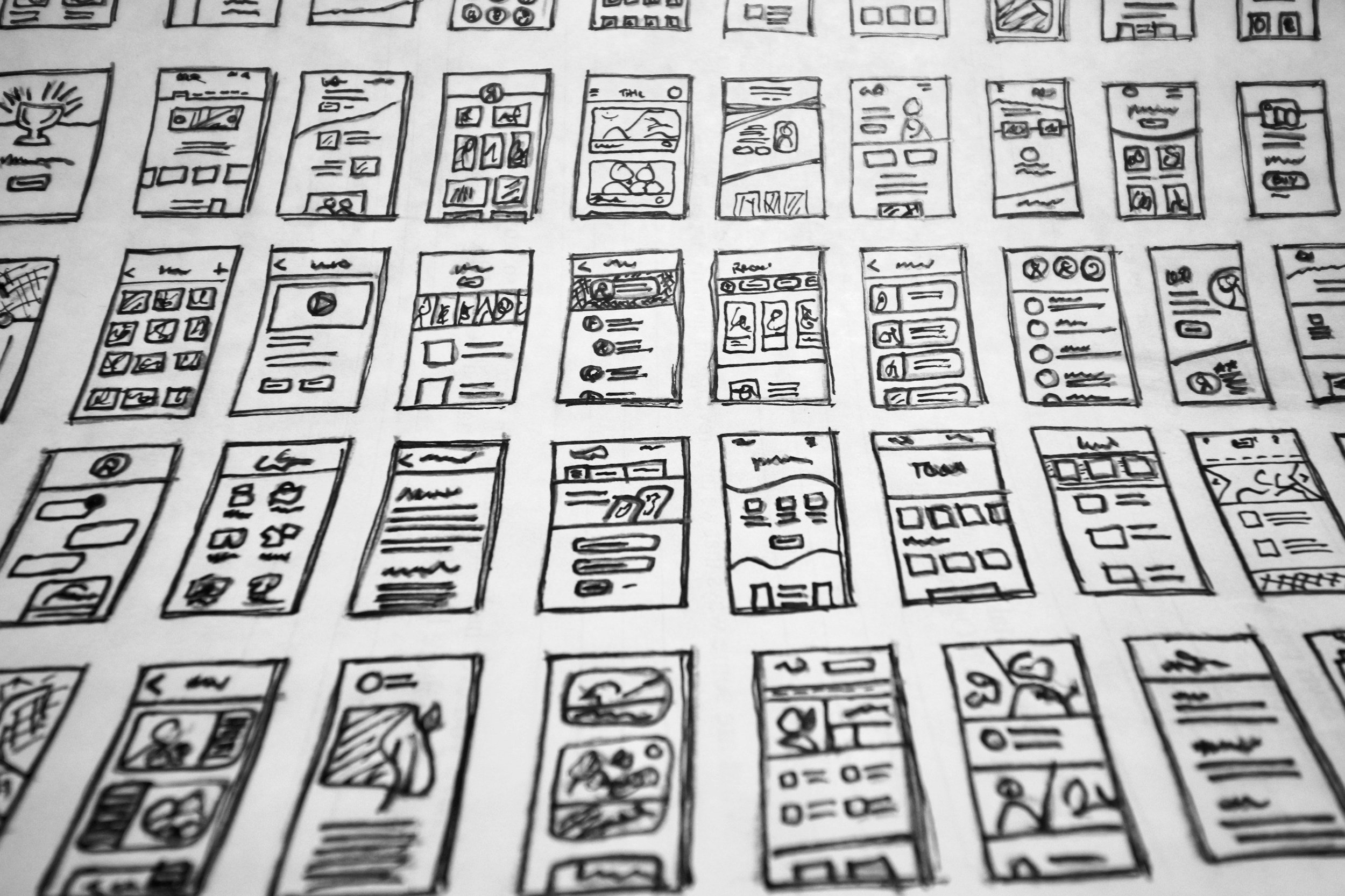
Working in close partnership with Goodlabs, the Kubex team developed the design strategy using Claude Cowork: user problems mapped, design principles set, navigation architecture defined, and detailed specifications written for each screen. Those specifications went into Claude Design, producing high-fidelity designs across 27 screens, reviewed and refined throughout with the GoodLabs team.
We built on that foundation. We designed in the open, with stakeholders and users reviewing from the first week. Changes were cheap because nothing had hardened into code yet.
Taking the Claude Design screens as our brief, we built standalone HTML prototypes, including A/B versions of the same screens and components. The expensive questions got settled in days, with no build step and no architecture in the way.
We turned the winning prototypes into a design system: components, a colour palette and reference screens, all documented in Storybook. One rule kept it clean. Nothing in the library fetches data, so adopting it was a presentation swap rather than a rewrite.
Then we rebuilt the existing pages on it, replacing the old components with the new ones and flagging any design that needed new data behind it before it could ship.
Several rounds of review followed, shipped in phases. Each phase applied progressive disclosure so the information arrived in digestible layers, and fixed navigation, labelling and drill-through as it went.
Before
A wall of numbers that rewarded power users who knew what to look for, but left everyone else without a clear place to start.
After
Clear calls to action, captions that say what each KPI means, and a navbar that is easier to scan.
Result
One design language across the app. 94 components and 249 tokens replaced one-off styling on every screen.
A wall of numbers became six intent-first cards. Reduce Waste. Eliminate Risk. Optimize GPUs. Manage Automation. Track Your Impact. Know What To Do. Each answers one question with one figure.
Kubex now ships with a point of view: the product knows what good looks like, shows it out of the box, and tells you what to act on first. Six ready-made boards, each with a sensible time window, all still configurable.
Every number leads somewhere. Rows and counts link into the explorer at the scope you were reading, and AI-generated optimization proposals can be reviewed as a diff and approved directly in the product, without leaving for a spreadsheet or a ticket.
Delivered in reviewable phases instead of one large merge.